The Story Behind the Blue Finance Mark

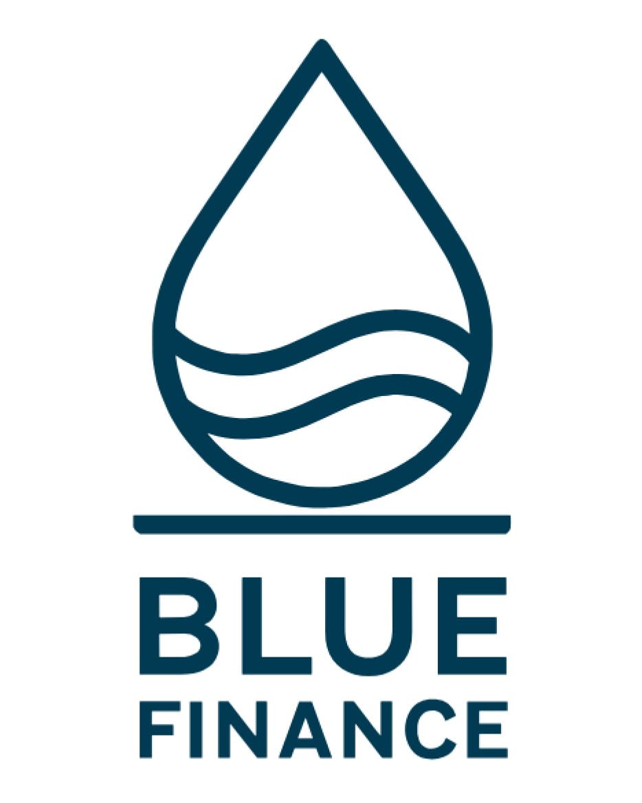
When I set out to define Blue Finance Canada, I wanted a symbol that felt honest to the work. Something simple, grounded, and rooted in the idea that the ocean is a living system, and that financial decisions shape its future. The design we chose is a single drop with two waves inside and a line beneath it. Each element is intentional and reflects how we think about this field.
A single drop
A drop in the ocean is a very small thing, yet the ocean is made of nothing else. This part of the logo reflects how individual decisions function in finance. One choice rarely shifts a system, but many choices taken with intention can have a positive cumulative effect.
The drop is a reminder that progress in ocean stewardship grows through steady, repeated decisions across public institutions, private capital, and local communities. And just as every drop in the ocean can be healthy or harmful, each decision in finance can support wellbeing or cause damage.
The waves inside the drop
The two waves show the connection between finance and the ocean. The first wave represents the ocean itself. There is the surface we see and the deeper systems that keep everything moving. Circulation, carbon storage, and nutrient flow all happen out of sight, yet they support the whole.
The second wave represents finance, which has its own layers as well. Policies, models, incentives, and externalities sit behind the scenes but shape real outcomes.
The two waves link these systems and the way they move together. Capital, like water, has flow. Together, the two lines point to balance between ecology and economy, and to finding a way to meet the needs of today while being mindful of the future.
The line beneath the drop
The solid line at the bottom grounds the symbol. It signals stability and a long-term perspective, both of which sit at the heart of responsible finance. It also serves as a metaphorical line in the sand. At some point we need to decide which side we stand on. We can operate in a way that extracts value at the ocean’s expense, or we can choose stewardship and accountability instead.
Why the symbol matters
Our logo may look simple, but each element has been chosen with care. It reflects a systems view, a long horizon, and a belief that meaningful change grows through small actions carried out with intention. The design is modest, which suits the work. It is also intentional, which suits the purpose.
Each decision we make adds a drop to the system. Our hope is that the drops we add help strengthen the ocean’s health and support a more sustainable way of making financial decisions.
